# options(error = NULL)
# options(browser = NULL)
# devtools::install_github("samrit2442/astronomR", force = T, cache = NULL)AstronomR - Working Examples
Introduction
This package is developed for doing cosmology and Astrophysics. In this post, we will learn how to use this.
The source code can be found here: https://github.com/samrit2442/astronomR.git
If you like, please visit and support us by giving star.
library(astronomR)Some use and example code
We will see few things.
- First, we will see some astronomical coordinate calculations.
- We will use our package to access Gaia data to make a H-R diagram.
- We will recreate many cosmological results.
Position and Motion of Stars
Normally in astronomy we use a different sort of angular system for location. We can easily do that in our package.
Let’s see how. Suppose, we have an angular value of \(d=177.74208^\circ\) We want to convert it into hour-minute-second. There is a very simple function.
deg_to_hms(177.74208)11H50M58.0992SCan we do the inverse?, Yup absolutely. Let’s see how:
hms_to_deg(11,50,58.09925)[1] 177.7421What else can be done?, Let’s say we want to find the path of some star in a particular location for a time interval. This can also be done using our package.
To do that, first we need to define the RA and Dec value of the star. Let’s see to do this. Also, let’s define the time of observation and it’s location.
ra_hour <- 16.695  # RA in hours
dec_deg <- 36.466667  # Dec in degrees
lat_obs <- 52.5  # Observer's latitude
lon_obs <- -1.9166667  # Observer's longitude
datetime <- as.POSIXct("1998-08-10 23:10:00", tz = "UT")  # Observation time
Warning in strptime(xx, f, tz = tz): unknown timezone 'UT'Warning in as.POSIXct.POSIXlt(x): unknown timezone 'UT'Warning in strptime(x, f, tz = tz): unknown timezone 'UT'Warning in as.POSIXct.POSIXlt(as.POSIXlt(x, tz, ...), tz, ...): unknown
timezone 'UT'Now, create the star location as seen from that location on the time mentioned. This returns Altitude and Azimuth as normally used.
star_location <- RA_dec2Alt_azi(ra_hour, dec_deg, lat_obs, lon_obs, datetime)Warning in as.POSIXlt.POSIXct(x, tz): unknown timezone 'UT'
Warning in as.POSIXlt.POSIXct(x, tz): unknown timezone 'UT'
Warning in as.POSIXlt.POSIXct(x, tz): unknown timezone 'UT'
Warning in as.POSIXlt.POSIXct(x, tz): unknown timezone 'UT'
Warning in as.POSIXlt.POSIXct(x, tz): unknown timezone 'UT'print(paste("Altitude:", star_location$altitude, "degrees"))[1] "Altitude: 49.1688687197424 degrees"print(paste("Azimuth:", star_location$azimuth, "degrees"))[1] "Azimuth: 269.146669462321 degrees"This tells us from some location, what is the position of star so that we can use telescope to watch it!
Using this simple function, we can trace out the path any star travels.
Let’s see how and also maybe plot it.
For that, let’s first make a time range, for which we want to see the location.
# Plotting Rigel's Motion
start_datetime <- as.POSIXct("2024-10-02 00:00:00", tz = "UTC")
end_datetime <- as.POSIXct("2024-10-03 00:00:00", tz = "UTC")

# Generate timestamps at 20-minute intervals
timestamps <- seq(from = start_datetime, to = end_datetime, by = "20 mins")
altitude <- numeric(length(timestamps))
azimuth <- numeric(length(timestamps))

observer_lat <- 43.1566  # Latitude in degrees
observer_lon <- -77.6088  # Longitude in degrees

# RA and Dec for Rigel (converted RA to hours)
rigel_ra <- 78.634467 / 15  # RA in hours
rigel_dec <- -8.20164  # Dec in degrees

# Calculate altitude and azimuth for each timestamp
for (i in seq_along(timestamps)) {
  datetime <- timestamps[i]
  result <- RA_dec2Alt_azi(rigel_ra, rigel_dec, observer_lat, observer_lon, datetime)
  altitude[i] <- result$altitude
  azimuth[i] <- result$azimuth
}

# Create a data frame with results
rigel_positions <- data.frame(datetime = timestamps, altitude = altitude, azimuth = azimuth)
Now, let’s plot it.
library(ggplot2)
# 2D Plot for Altitude over Time
ggplot(rigel_positions, aes(x = datetime, y = altitude)) +
  geom_line() +
  labs(x = "Time", y = "Altitude (degrees)", title = "Altitude of Rigel over 24 hours")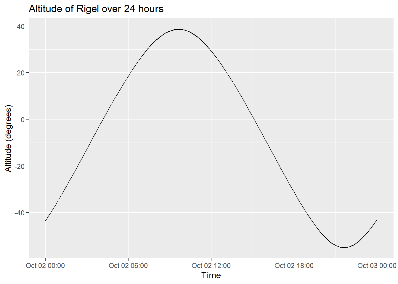
# 2D Plot for Azimuth over Time
ggplot(rigel_positions, aes(x = datetime, y = azimuth)) +
  geom_line() +
  labs(x = "Time", y = "Azimuth (degrees)", title = "Azimuth of Rigel over 24 hours")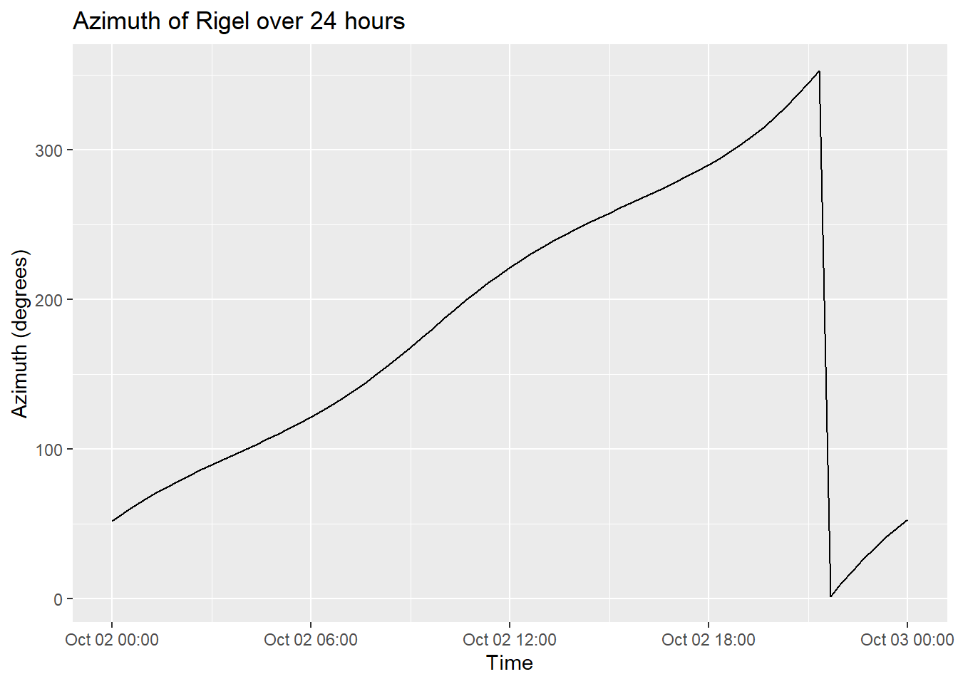
# 2D Scatter Plot for Azimuth vs Altitude
ggplot(rigel_positions, aes(x = azimuth, y = altitude)) +
  geom_point(color = "firebrick") +
  labs(x = "Azimuth (degrees)", y = "Altitude (degrees)", title = "Azimuth vs Altitude for Rigel over 24 hours")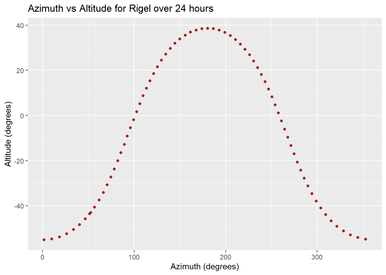
Let’s see a 3D plot of it.
library(plotly)
Attaching package: 'plotly'The following object is masked from 'package:ggplot2':
last_plotThe following object is masked from 'package:stats':
filterThe following object is masked from 'package:graphics':
layoutplot_ly(rigel_positions, x = ~azimuth, y = ~altitude, z = ~datetime, type = 'scatter3d', mode = 'lines+markers',
marker = list(color = ~altitude, colorscale = 'Viridis', showscale = TRUE)) %>%
layout(scene = list(xaxis = list(title = 'Azimuth (degrees)'),
yaxis = list(title = 'Altitude (degrees)'),
zaxis = list(title = 'Time')),
title = '3D Plot of Rigel\'s Diurnal Motion')Gaia Data Archive
The Gaia Data Archive is a comprehensive database that houses the data collected by the European Space Agency’s Gaia mission. Launched in December 2013, Gaia is designed to create the most accurate three-dimensional map of the Milky Way galaxy by observing and cataloging the positions, distances, and motions of over a billion stars.
In python Astropy and Astroquery is used to import data directly. We can do the same thing in our package. Let’s see how:
df <- get_gaia_data(vars = "ra, dec, parallax", condition = "parallax > 50")
head(df)
ra dec parallax
1 316.7537 38.75607 286.00534
2 316.7485 38.76386 285.99493
3 298.4819 44.41291 214.57451
4 249.3875 -53.69952 53.22840
5 243.4453 -57.57679 73.54824
6 312.2788 37.47123 56.86465Nice! Isn’t it?
Let’s use this for some analysis. Why not create H-R diagram.
For this first, let’s see convert parallax to absolute magnitude.
library(dplyr)
Attaching package: 'dplyr'The following objects are masked from 'package:stats':
filter, lagThe following objects are masked from 'package:base':
intersect, setdiff, setequal, unioncalculate_absolute_magnitude <- function(parallax, g_mag) {
distance_pc <- 1 / (parallax / 1000)
abs_mag <- g_mag - 5 * (log10(distance_pc) - 1)
return(abs_mag)
}Now, let’s import the data:
df <- get_gaia_data(vars = "ra, dec, parallax, phot_g_mean_mag, phot_bp_mean_mag, phot_rp_mean_mag",
                    condition = "parallax > 50")
#data processing
df <- df %>%
  mutate(color_index = phot_bp_mean_mag - phot_rp_mean_mag,
         abs_mag = calculate_absolute_magnitude(parallax, phot_g_mean_mag))
# Filter out any rows with NA values
df <- df %>% filter(!is.na(color_index), !is.na(abs_mag))
Finally,
ggplot(df, aes(x = color_index, y = abs_mag)) +
  geom_point(alpha = 0.5, color = "blue") +
  labs(x = "Color Index (G_BP - G_RP)", y = "Absolute Magnitude (M)",
       title = "Hertzsprung-Russell Diagram") +
  theme_minimal() +
  scale_y_reverse()  # Reverse the y-axis for magnitude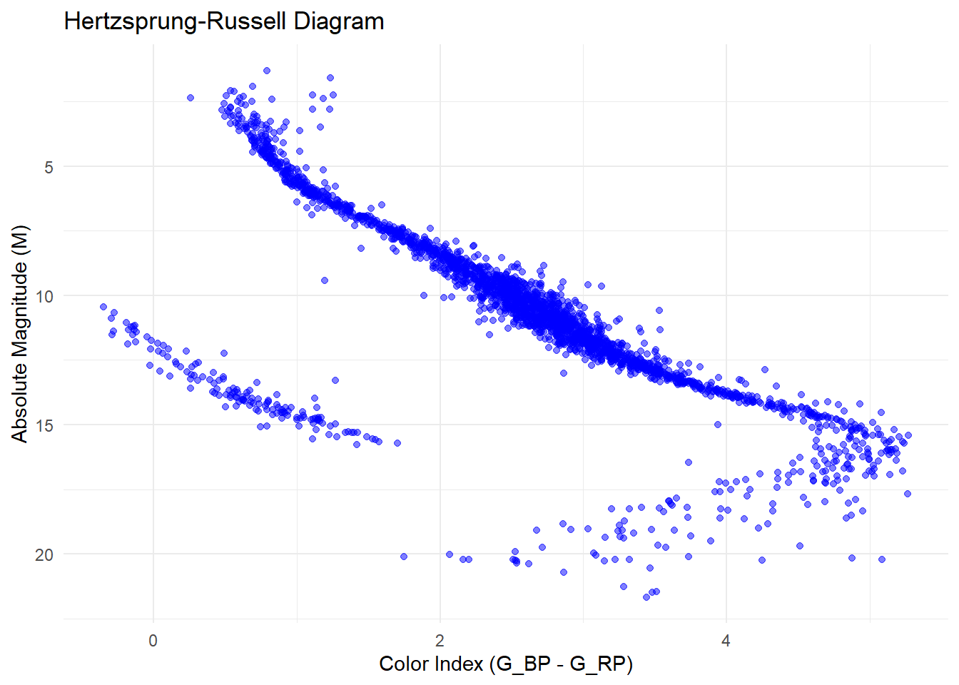
We can also write a function if we want.
plot_hr_diagram_hexbin <- function(df, bins = 60, color_low = "purple", color_high = "blue") {

  df <- df[!is.na(df$phot_bp_mean_mag) & !is.na(df$phot_rp_mean_mag) & !is.na(df$parallax),]

  df$color_index <- df$phot_bp_mean_mag - df$phot_rp_mean_mag
  df$abs_mag_g <- df$phot_g_mean_mag + 5 * (log10(df$parallax / 1000) + 1)

  ggplot(df, aes(x = color_index, y = abs_mag_g)) +
    stat_binhex(bins = bins, aes(fill = ..count..)) +
    scale_fill_gradient(low = color_low, high = color_high) +
    scale_y_reverse() +
    labs(
      title = "Hertzsprung-Russell Diagram",
      x = "BP - RP Color Index",
      y = "Absolute Magnitude (G)"
    ) +
    theme_minimal() +
    theme(
      plot.title = element_text(hjust = 0.5),
      axis.title = element_text(size = 12),
      axis.text = element_text(size = 10)
    )
}
# Call the plotting function
plot_hr_diagram_hexbin(df)
Warning: The dot-dot notation (`..count..`) was deprecated in ggplot2 3.4.0.
ℹ Please use `after_stat(count)` instead.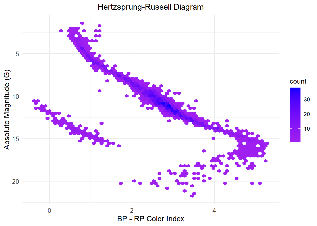
Cosmological Calculation
We can do many things related to cosmology using this. Let’s see few of them. Before that, I will suggest to run this code.
options(digits = 17)As we know, there are many cosmological models. You can define these in our package.
Normally, It takes \(h\) in \(km \cdot Mpc^{-1} S^{-1}\), \(\Omega_r\), \(\Omega_m\), \(\Omega_k\) and \(\Omega_\Lambda\).
cosmo <- FlatLCDM(0.6774,0.6911,0.3089,8.4e-5)
cosmo
$hubble_constant_fact
[1] 0.6774
$dark_matter_crit
[1] 0.69110000000000005
$matter_crit
[1] 0.30890000000000001
$radiation_crit
[1] 8.3999999999999995e-05
$type
[1] "FlatLCDM"
$h_per_s
[1] 2.1949477836373805e-20We can also, just give parameters into cosmology_model function. It will auto-detect the type.
cosmo1 <- cosmology_model(hubble_constant_fact=0.6774, curvature_crit = 0.0001, dark_matter_crit = 0.6911, matter_crit = 0.3089, radiation_crit = 0)
cosmo1
$hubble_constant_fact
[1] 0.6774
$curvature_crit
[1] 1e-04
$dark_matter_crit
[1] 0.69110000000000005
$matter_crit
[1] 0.30890000000000001
$radiation_crit
[1] 0
$type
[1] "OpenLCDM"
$h_per_s
[1] 2.1949477836373805e-20Now, we can directly use this models and inputs of other functions.
As we know scale factor of our universe \(a=1\) today. We can directly use our function to calculate time at any given \(a\) value.
t_as_func_a_in_Year(cosmo,1)#in year[1] 13808979942.748983We can find the age of our universe using this or use the function age_of_universe_GY (use age_of_universe ).
age_of_universe_GY(cosmo)#our universe age !!!!![1] 13.808979942748984Our library can find radius of curvature of our universe. Let’s see:
radius_of_curvature(cosmo)[1] 0radius_of_curvature(cosmo1)#in Km[1] 1.3658295665840202e+25Sometimes it’s useful to know luminosity distance. This can also be done. Let’s make a plot of it with two different model of universe, one with dark matter and one with not!
hubble_constant_fact <- 0.7
dark_matter_crit_dm <- 0.6911  # With dark matter
dark_matter_crit_no_dm <- 0    # Without dark matter
matter_crit_dm <- 0.3089
matter_crit_ndm <- 1.0
radiation_crit <- 0

cosmo_dm <- FlatLCDM(hubble_constant_fact, dark_matter_crit_dm, matter_crit_dm, radiation_crit)
cosmo_no_dm <- FlatLCDM(hubble_constant_fact, dark_matter_crit_no_dm, matter_crit_ndm, radiation_crit)

z_values <- seq(0.0011, 10, by = 0.01)

lum_dist_dm <- numeric(length(z_values))
lum_dist_no_dm <- numeric(length(z_values))

for (i in seq_along(z_values)) {
  lum_dist_dm[i] <- km_to_mpc(luminosity_distance(cosmo_dm, z_values[i]))
  lum_dist_no_dm[i] <- km_to_mpc(luminosity_distance(cosmo_no_dm, z_values[i]))
}
lum_dist_df <- data.frame(
redshift = rep(z_values, 2),
luminosity_distance = c(lum_dist_dm, lum_dist_no_dm),
model = rep(c("With Dark Matter", "Without Dark Matter"), each = length(z_values))
)
ggplot(lum_dist_df, aes(x = redshift, y = luminosity_distance, color = model)) +
geom_line(size = 1) +
scale_y_log10() + # Logarithmic scale for the y-axis
# scale_y_continuous(limits = c(10, 100)) +
labs(
title = "Luminosity Distance vs. Redshift",
x = "Redshift (z)",
y = "Luminosity Distance (Mpc)",
color = "Cosmology Model"
) +
theme_minimal() +
theme(
plot.title = element_text(hjust = 0.5),
axis.title = element_text(size = 12),
axis.text = element_text(size = 10)
)Warning: Using `size` aesthetic for lines was deprecated in ggplot2 3.4.0.
ℹ Please use `linewidth` instead.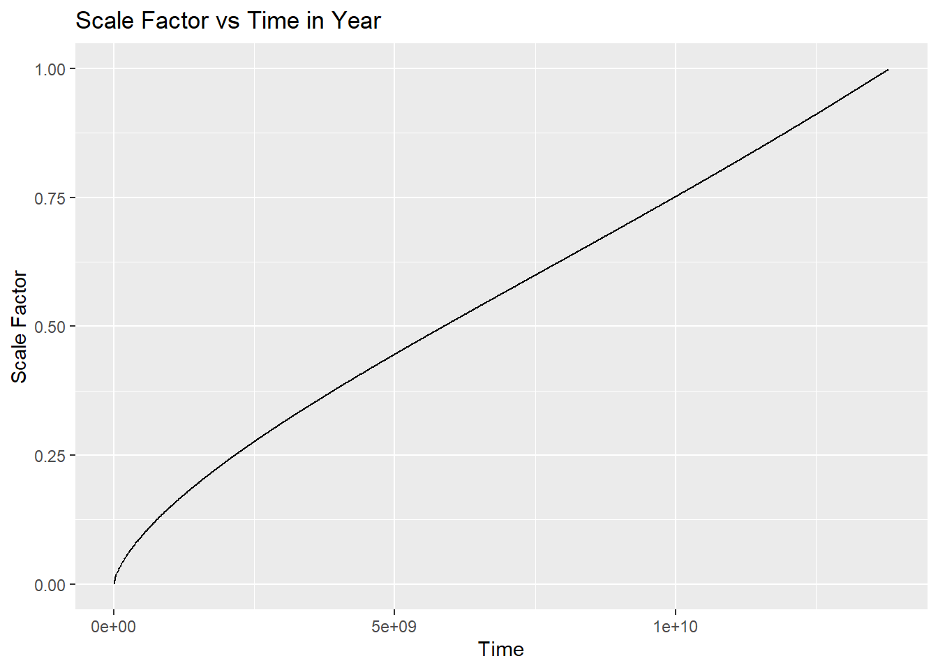
We can also plot the metric distance itself.
metric_distance(cosmo,100)#z=100[1] 3.9660418234098892e+23Astropy gives \(3.971154\times 10^{23}\) KM.
We can also study angular distance using this package. Let’s see a quick example.
z_values <- seq(0.001, 10, by = 0.1)

# Define the cosmological models
flat_model <- FlatLCDM(hubble_constant_fact = 0.6774, dark_matter_crit = 0, matter_crit = 1, radiation_crit = 0)
closed_model <- ClosedLCDM(hubble_constant_fact = 0.6774, curvature_crit = -0.1, dark_matter_crit = 0, matter_crit = 1.0, radiation_crit = 0)
open_model <- OpenLCDM(hubble_constant_fact = 0.6774, curvature_crit = 0.1, dark_matter_crit = 0, matter_crit = 0.9, radiation_crit = 0)

# Initialize empty vectors to store angular diameter distances
flat_DA <- numeric(length(z_values))
closed_DA <- numeric(length(z_values))
open_DA <- numeric(length(z_values))

# Calculate angular diameter distance for each redshift for each model
for (i in seq_along(z_values)) {
  z <- z_values[i]

  flat_DA[i] <- km_to_mpc(angular_diameter_distance(flat_model, z))
  closed_DA[i] <- km_to_mpc(angular_diameter_distance(closed_model, z))
  open_DA[i] <- km_to_mpc(angular_diameter_distance(open_model, z))
}

# Create a data frame for plotting
data <- data.frame(
  z = rep(z_values, 3),
  DA = c(flat_DA, closed_DA, open_DA),
  Model = factor(rep(c("Flat", "Closed", "Open"), each = length(z_values)))
)

# Plot the angular diameter distance vs redshift
ggplot(data, aes(x = z, y = DA, color = Model)) +
  geom_line(size = 1) +
  scale_y_log10() +  # Logarithmic scale for y-axis
  scale_y_continuous(limits = c(500, 1500)) +
  labs(
    x = "Redshift (z)",
    y = "Angular Diameter Distance (Mpc)",
    title = "Angular Diameter Distance vs Redshift (Log Scale)"
  ) +
  theme_minimal() +
  scale_color_manual(values = c("Flat" = "blue", "Closed" = "red", "Open" = "green")) +
  theme(
    plot.title = element_text(hjust = 0.5, size = 14),
    axis.title = element_text(size = 12),
    axis.text = element_text(size = 10)
  )
Scale for y is already present.
Adding another scale for y, which will replace the existing scale.Warning: Removed 6 rows containing missing values or values outside the scale range
(`geom_line()`).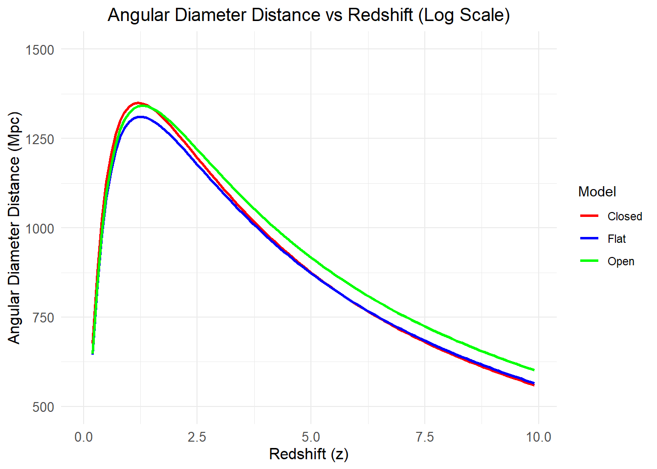
We will end this with one final example.
Let’s try to make a plot of time vs scale factor.
t_values <- seq(1, 13808979942.74, by = 10^7)
a_vals <- numeric(length(t_values))
for (i in seq_along(t_values)) {
  a_vals[i] <- a_of_t(cosmo, t_values[i])
}

df <- tibble(t_values, a_vals)

ggplot(df, aes(x = t_values, y = a_vals)) +
  geom_line() +
  labs(x = "Time", y = "Scale Factor", title = "Scale Factor vs Time in Year")
See!! How beautiful is it.
There are many more functions coming soon. Wait for the documentation for more!